Creating a Youtube interface experience on a 1.5 inch radius watch
Client
Youtube
Year
2025

Main Screen
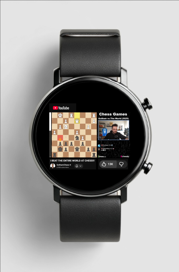
Purpose / Requirement Fulfilled:
Play and pause the video (top-right crown when clicked on once.
Turn volume up/down (rotate up or down on the top right crown.
Like/Dislike Video (thumbs up or down)
Other features for easier access (my little additions!):
Two-finger pinch = Zoom into the video interface
Click both buttons at once = Exit YouTube app
Principles Applied: Size + Central Emphasis
Video is centered and largest → primary action stays obvious on small screen.
Micro-Interaction (Play/Pause):
Trigger = button press → icon change + haptic feedback → persistent playback state.
Interaction Principles:
Mapping: Crown works like a physical volume dial.
Visibility: Like/Dislike icons are clearly exposed, not hidden in menus.
Recommended Videos Screen
Purpose / Requirement Fulfilled:
Show at least three recommended videos.
Custom Interactions:
Scroll up to find recommended videos
Goal Gradient Effect:
A feeling of movement and progress is created while scrolling vertically. This encourages them to discover more
Visual Hierarchy:
The thumbnails play a dominant role on each row for easy decision-making.
Notification Screen List
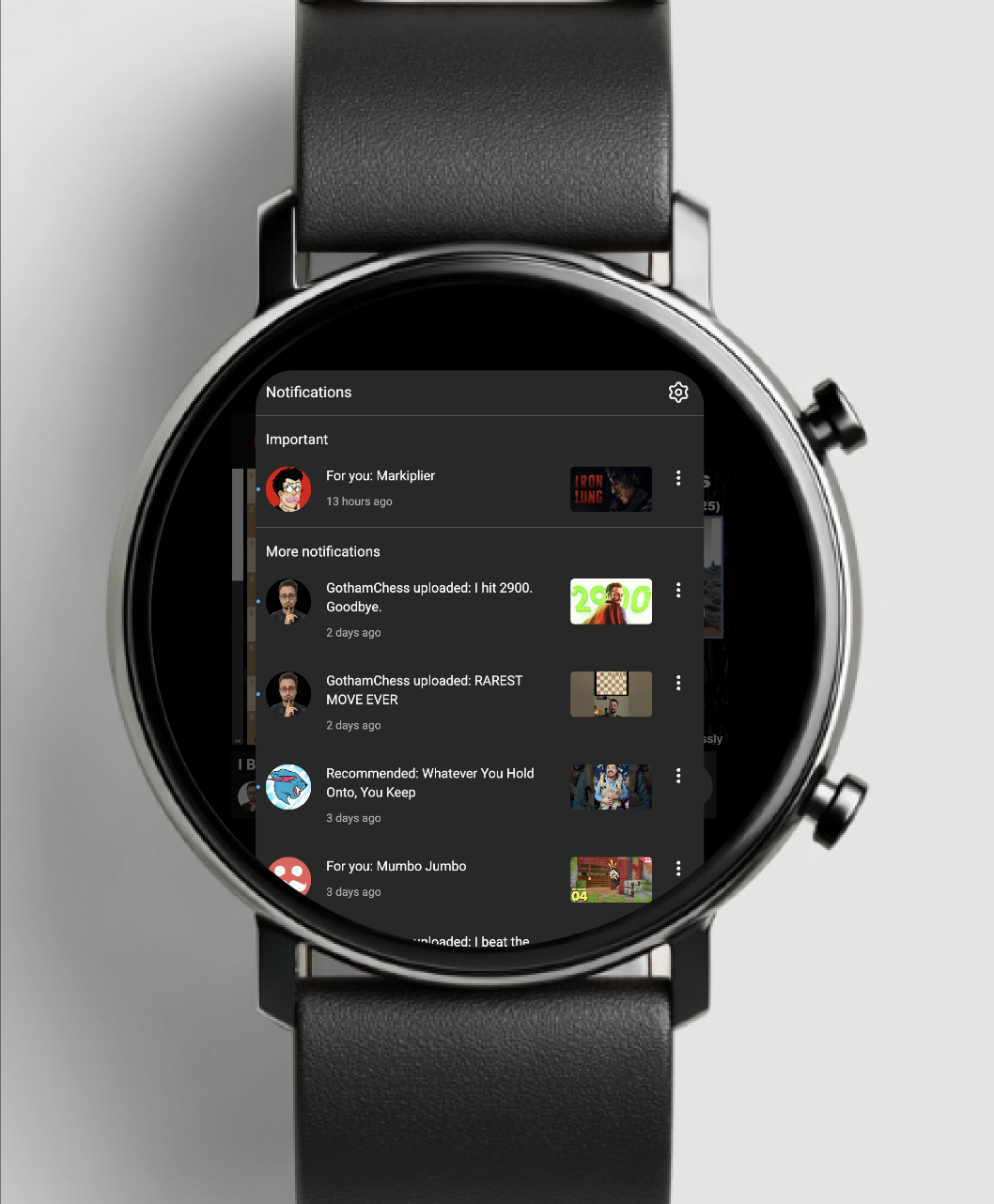
Purpose / Requirement Fulfilled:
Go back to notifications and select all notifications
Custom Interactions:
To open the notification list, double-click on the bottom right crown.
Interaction Principle – Consistency:
In each notification row, there is a uniform layout for easy scanning.
Chunking:
The notifications are presented in easy-to-read chunks.
Comment Viewing Screen
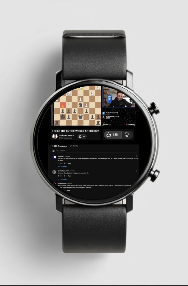
Purpose / Requirement Fulfilled:
Read/view Comments
Custom Interactions:
Scroll Down to find comments, zoom in for readability as well
Interaction Principles:
Mapping: The crown searches through comments in a natural and intuitive way.
Constraints: Two-line previews prevent the text from being overwhelming.
Chunking:
Comment split into small pieces with a name and a description helps to alleviate the cognitive load.